
Context
GS1 Italy’s platform is a data-driven tool used to search, manage, and export product information within the GS1 ecosystem. While the platform supported a wide range of business needs, the current experience had evolved into a complex set of workflows that made everyday tasks harder than they needed to be and created unnecessary friction.
From a business perspective, GS1 Italy needed to rethink the platform’s interface and overall experience to better support its commercial offering and the expectations of its clients. The redesign was an opportunity to evolve the product into a more accessible, coherent, and competitive experience, addressing the friction identified through research while creating a stronger foundation for the platform’s future development.
The problem
Research had surfaced pain points across two fronts, GS1 Italy's own business needs, and the day-to-day needs of the platform's end users. Two issues stood out as the most disruptive to actual daily use:
- Search lived on the homepage only: if a user needed to search from anywhere else in the platform, they had to navigate all the way back to the homepage first, breaking whatever task they were in the middle of
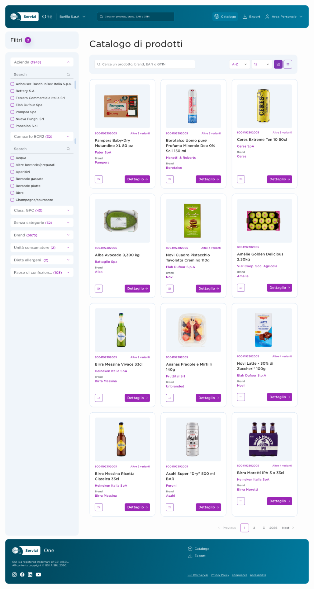
- Filtering behaved like a nested catalogue, not a filter, and filters blocked each other: clicking a single filter didn't narrow the results, it dropped the user into a chain of sub filters. On top of that, filters were nested: choosing a brand or format disabled the rest until you cleared everything and started over
- Selection and cart mechanics didn't fit a data tool: users couldn't select a single product, every action was bulk-only. Removing one item meant emptying the whole cart and starting again ("I added a product by mistake and had to reload them all"), with no confirmation before a destructive action like that. "Add to cart" itself was the wrong metaphor: one user described it as feeling more like e-commerce than a data tool
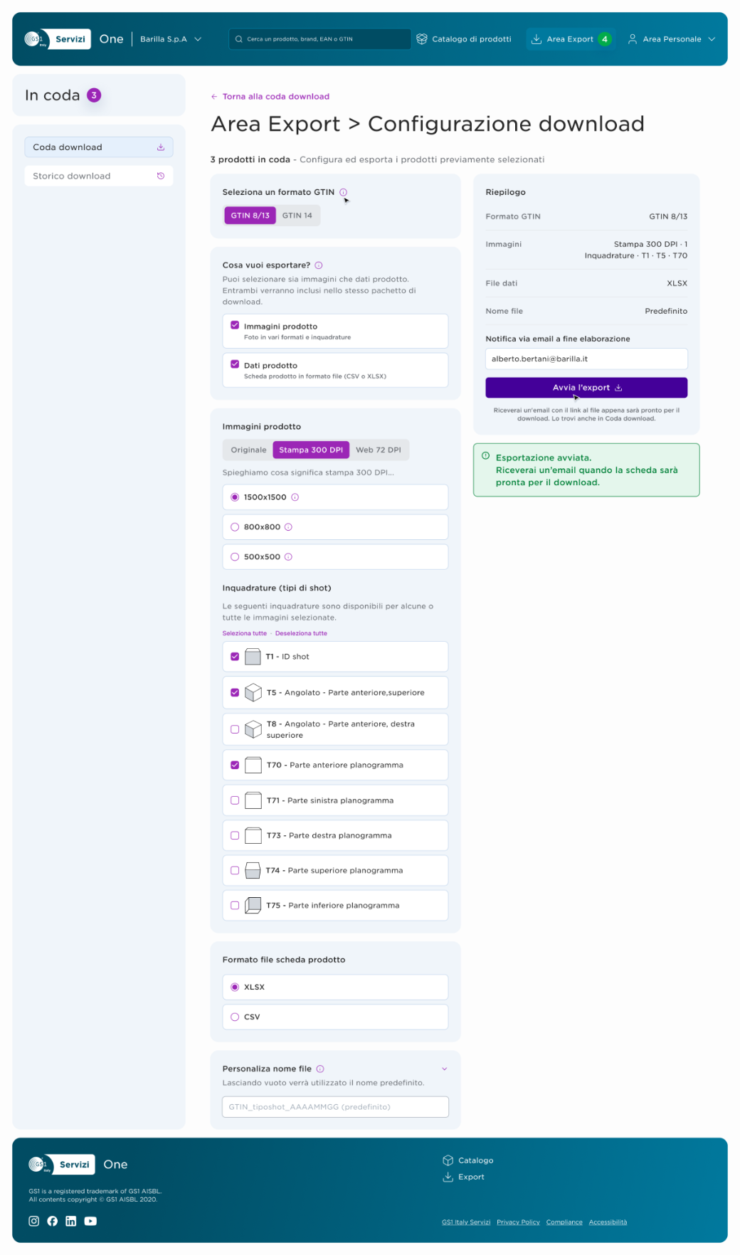
- Export added friction instead of removing it: too many steps and flags to get through, then no reliable signal that a download had actually finished
- Browsing had two inconsistent entry points into the same content: clicking a category's chevron led to a sub-category; clicking the button itself skipped straight to all products. From there, "all products" was a long dropdown list rather than a real search
Process
Auditing the existing platform against real needs
Before proposing anything, I went through the existing research and analysis, and ran my own audit of the current platform, specifically evaluating it against GS1's business needs and the pain points already identified during the interview phase, rather than working from assumptions.
A new sitemap before a single screen
Before any interface work, I mapped the current sitemap and marked where it broke down, then proposed a new one. Restructuring the site's skeleton first meant every screen that followed was built on a structure that already made sense, instead of patching problems screen by screen.
Mapping the flow, then validating it with the client
From the new sitemap, I mapped the UX flow, then took both the sitemap and the flow through review sessions with the client before moving forward. Validating the structural decisions before touching visual design meant later disagreements were about details, not the direction itself.
Information architecture, decided screen by screen
Once the sitemap and flow were validated and approved by the client, I worked through the information architecture with end users' needs as the constant reference, deciding, screen by screen, what information to keep as-is, what to replace, and what to rework so the system was actually legible to the people using it.
Brand work & One’s UI Kit and component library
Before screens, I proposed a design system for the platform: a typography scale, an accessible color system built on GS1 and GS1 Italy Servizi's brand colors, and a full component library.
Designing the system
The direction validated through the sitemap and flow work became a full working prototype, covering the catalog, product detail, and export experience end to end, built on a UI Kit and component library for the platform. One principle ran through every part of it: keep pages flat. Menus and navigation were deliberately kept to a single level, avoiding the kind of nested structure that had caused so much of the original confusion, every path stayed shallow enough that entropy couldn't creep back in.
Outcome
Today, the platform's experience is built around four qualities that trace directly back to that foundation: simplicity in accessing a genuinely dense information set, clarity from content organized into an actually legible hierarchy, guided navigation from search through to full product detail, and immediate access to the core actions people need most.
Lesson learned
GS1 ONE already had everything a platform like this is supposed to need: certified sources, a reconciled data model, full technical coverage of the catalog. This project was a clear reminder that data and coverage are just the foundation, what actually creates impact for the person on the other end is whether they can reach the information simply, without fighting the interface to get there.
A platform can be technically complete and still fail the person using it if that last stretch isn't effortless. That's the part I'd protect on any data-heavy project: the coverage earns the platform its right to exist, but the experience is what earns the user's trust in it.