
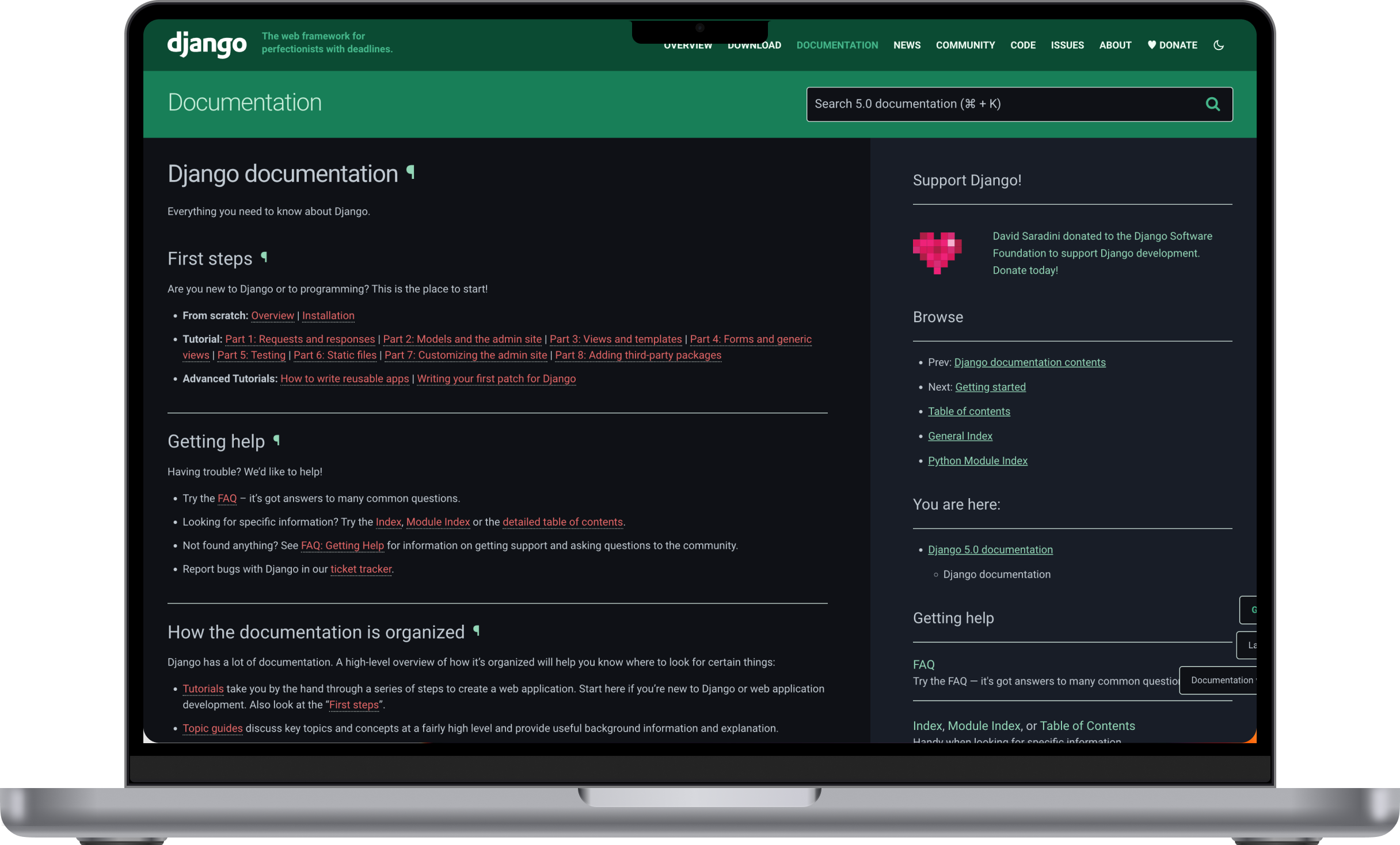
Context
Django is the free, open-source Python web framework used daily by developers worldwide, including the team at 20tab. During DjangoCon US 2022, the Django Software Foundation asked for help improving the user experience of djangoproject.com, the central hub where the framework's global community learns, documents, and contributes. This became a year-long, collaborative research project.
The problem
The Foundation suspected users weren't fully satisfied with the site's usability, accessibility, flow, and content, but had no concrete evidence of where the friction actually lived or how much it mattered. djangoproject.com isn't a marketing site; it's the primary reference point for a global developer community, so any unresolved friction there has an outsized, compounding cost across thousands of daily sessions.
Process
Structural evaluation
Before involving users, the team ran a heuristic evaluation against Nielsen's 10 usability heuristics. Each designer evaluated the site independently first, to gather genuinely different perspectives, then the findings were reviewed together as a group. This surfaced concrete issues early: poor color contrast in titles, the navigation bar, and footer commands; inconsistent link styling that made links hard to recognize as links; missing calls to action and system feedback; and confusing navigation spread across too many dispersed links.
Turning findings into priorities to test
The evaluation's findings were synthesized into a smaller set of priorities; system status feedback, recognition over recall, and consistency and standards, alongside the broader themes of information architecture, accessibility, and style, giving the research that followed specific things to confirm or challenge.
Listening to the community at scale
The team distributed a community-wide survey, presented at PyCon Italia, DjangoCon Europe, and DjangoCon US 2023, which gathered 545 responses. The results lined up with the heuristic findings: the most critical points users raised were the interface, information architecture, and navigation.
Information architecture, decided screen by screen
Once the sitemap and flow were validated and approved by the client, I worked through the information architecture with end users' needs as the constant reference, deciding, screen by screen, what information to keep as-is, what to replace, and what to rework so the system was actually legible to the people using it.
Going deeper with real users
5 semi-structured interviews were ultimately conducted, roughly 30 minutes each, digging into usability, accessibility, content quality, and user flow.
Beyond those headline concerns, the interviews filled in a fuller picture. Aesthetics and readability were already seen as a strength, not something to fix, the real appetite was for richer, example-driven content, including the ability to contribute directly through the repository, and for a community section that felt more alive, with better visibility into events. Smaller requests around learning resources and dark mode rounded out the rest.
Outcome
The research converged on eight clear areas of concern, each paired with specific, prioritized recommendations delivered to the Django Software Foundation in a full report:
Information architecture: simplifying navigation and adding tools like a site map would help people actually find what they're looking for.
Accessibility: a missing accessibility statement, weak color contrast, and gaps in keyboard navigation stood out on a project whose own community values inclusion.
Search experience: people default to Google over the site's own search. A strong signal that internal search isn't trusted to do the job.
Aesthetics, content, learning resources, community engagement, and dark mode rounded out the picture, each with its own concrete opportunities for improvement.
What’s next?
The project closed with its own recommendation to keep going: continuous discovery, interviewing junior users, board members, DSF staff, and donors based on whichever improvement goals get prioritized next.
If applied, these recommendations would cut the navigation friction that sends people looking for a workaround, close the gap between the site's stated commitment to an inclusive community and its actual accessibility, and reduce how often people bypass Django's own search in favor of Google, restoring trust in a tool the community should be able to rely on first.