
Context
Knowledge Share is Italy's largest matchmaking platform for deeptech innovation. Its role is to connect universities, research entities, and public research organizations with businesses, presenting patents, technologies, and spin-offs in a way non-technical audiences can act on, helping industry, innovators, and academia actually find each other. The European Union recognized Knowledge Share in 2021 as a best practice for IP valorization.
I was the Lead UX & UI designer on the project end-to-end since 2023, shaping it into the connected, cohesive product serving that community today.
The problem
Knowledge Share didn't start this engagement as one product. It existed as several separate systems stitched together; a WordPress site, a separate CRM, and an independent events/webinar system, rather than a single, coherent platform.
Netval's need was to consolidate all of it: one system capable of serving four distinct audiences at once, guest visitors, research-side contributors bringing intellectual property and spin-offs to the platform, business-side users looking for technology worth pursuing, and the internal team managing content and users behind the scenes, while presenting deeptech content in a genuinely simple format for an audience that isn't necessarily technical.
Process
Spec analysis and roadmap shaping
Netval came in with a full specification of what they wanted from Knowledge Share 2.0. Together with the engineering team, I went through it to extract every implied feature, then created a roadmap, a user story map, and an opportunity solution tree to sort what mattered most in order to start prioritizing, separating a core release (content management, the CRM, the homepage, tag and contact management) from capabilities that could follow once the MVP was released, rather than trying to build everything the spec described at once.
Auditing the old platform firsthand
Before proposing a new experience, I ran a full heuristic evaluation of Knowledge Share 1.0 against Nielsen's usability heuristics. It surfaced concrete, fixable problems: no loading feedback on slow transitions, so people would click repeatedly out of impatience; interactive elements that didn't visibly change state on hover or click; external links that broke the navigation flow by opening in the same tab, and others that claimed to be external but weren't; a profile page with no way to safely cancel an edit or get warned before losing unsaved changes; and color contrast low enough to make it hard to tell whether a link was active, focused, or pressed.
Turning a client survey into real personas
Netval had already surveyed the platform's existing users. I analyzed that survey data to map out where the opportunities actually were, and from it identified three personas covering the platform's core audiences, the same structural split the platform itself is built around: research-side users bringing intellectual property and spin-offs to the platform, business-side users looking for technology to invest in or license, and the internal team managing the system itself.
Personas validation & interviews
From the three personas, we interviewed people who actually matched each profile, rather than treating the survey-derived personas as the final word. The insights from those interviews were synthesized into conclusions and presented back to Netval, and what would actually get proposed for the new platform was agreed together from there.
Sitemap and user journey
With the opportunity solution tree fine-tuned against everything learned so far, I defined the platform's new sitemap and the final user journey, the structural backbone the design system and every screen after it would be built on.
Shaping the brand & design system: Shipping the first release
The new platform needed its own visual identity, but not from a blank page, it had to stay rooted in Netval and Knowledge Share's existing brand while feeling genuinely modern. That meant gathering brand direction from the existing identity and carrying it forward rather than replacing it outright.
I designed the full design system for the platform, components, brand colors, palettes, typography, and interaction patterns, and used it to design every feature agreed for the initial release, which was then developed and delivered.
Growing the platform, one release at a time
Since that first release, the work has continued incrementally, each addition tied to a clear business rationale rather than added for its own sake. Multi-tenancy, for instance, gives partner organizations their own branded version of the platform under the same underlying system, a deliberate move to open new partnerships without fragmenting the product.
Outcome
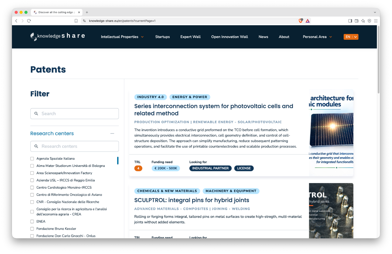
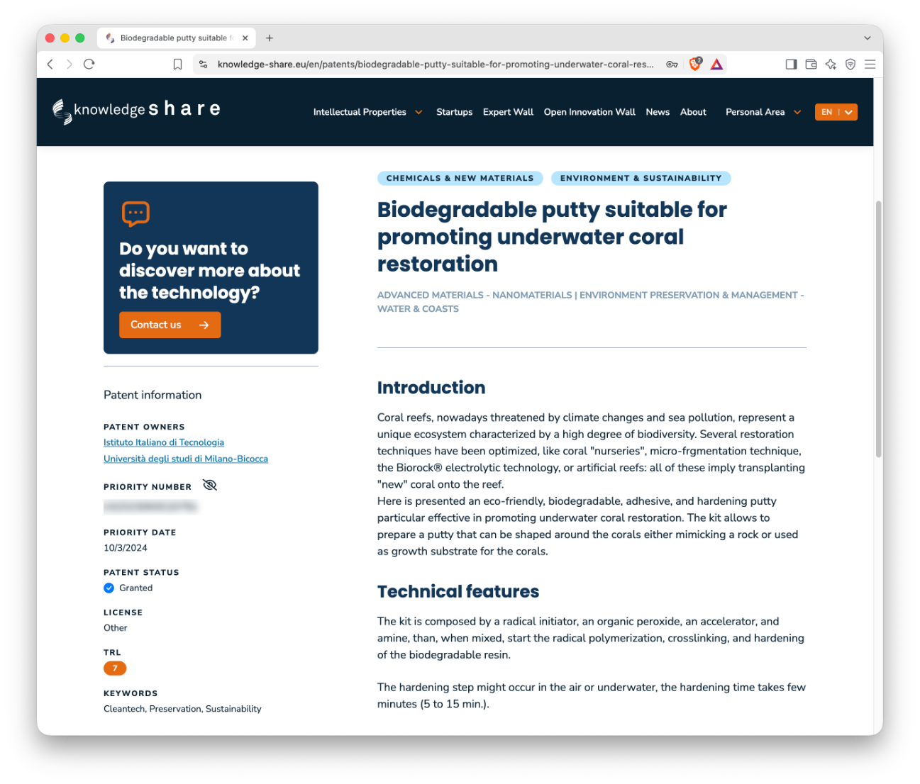
What had been four disconnected systems, became one coherent product, serving guest, research, business, and internal users from a single, consistent structure. The first release delivered the platform's content core: the Intellectual Property, Spin-off, and Open Innovation walls, alongside the CRM, homepage, tag management, and contact management.
The first release delivered the platform's content core: the Intellectual Property, Spin-off, and Open Innovation walls, alongside the CRM, homepage, tag management, and contact management, all designed against personas validated through real interviews rather than assumptions carried over from the old system.
The numbers back that up. Since the platform's relaunch, Knowledge Share has averaged around 30,000 views a month, built a base of more than 4,200 registered users, and reached 76,000 active users overall.
per month
release
since release
What’s next?
Knowledge Share has matured into a full, established product, but a platform that keeps growing eventually asks new questions of its own design. The clearest one is the front door: as the platform has scaled, its homepage carries far more than it was originally shaped to hold, and bringing it back in line with everything the platform now offers is the natural next conversation.