
Context
Procedo Retail is a web platform for managing EDI (Electronic Data Interchange) documents; purchase orders, order confirmations, shipping notices, receipt notices, invoices, exchanged between small and medium retailers and their suppliers, built to the GS1 EURITMO standard. Every distributor company gets its own private workspace, and GS1 itself sits above all of them with its own administrative view.
The problem
GS1's existing EDI tooling was built for larger, EDI-fluent distributors, it assumed a level of familiarity with EDI that small and medium distributors simply don't have.
Procedo Retail's brief was to open that door: a simple entry point built specifically for people approaching EDI for the first time. The heaviest weight of the request sits on the technical side, modelling the document flows and business rules correctly, on the design side; simpler interactions and a smooth, frictionless flow mattered too, precisely because the audience couldn't be expected to push through complexity the way an experienced EDI manager could.
On top of that sat a structural challenge, the platform had to serve two genuinely different user bases at once: the distributor companies exchanging documents with their suppliers, and GS1's own internal team, who needed an administrative layer to oversee every distributor on the system.
Process
Trade-offs, constraints, & compromises
One thing held true across every phase of the project: decisions and trade-offs included were worked out in continuous conversation with both the client and the development team.
All the design, architecture, and structural decisions that got approved weren’t just what the client liked or preferred, but what was genuinely feasible to develop within the project's constraints.
Understanding the system
GS1 came in with a clear, detailed functional analysis of the product they wanted. Rather than starting research from scratch, I read through the entire document and extracted every possibile feature, then organized the work around jobs to be done rather than personas, since the target audience (small/medium distributors managing EDI) was specific and consistent enough that job-based thinking gave more traction.
Mapping the process as it actually worked
A deeper analysis on the exchange interaction between distributors and retailers work was performed in order to understand and map how the document exchange process work. From the jobs to be done, I mapped the full process and task flow users would go through, and used that mapping to corroborate the jobs I'd identified, giving the project a validated foundation before any structural decisions were built on top of it.
This was perhaps the toughest part of the project because of its complexity. So in order to better approach the process representation, most of the mapping was done in collaboration with the software architect, then confirmed and validated by the client.
With the as-is process mapped, I proposed the to-be sitemap and task flow, the structure the rest of the platform would be built on.
Making ideas ‘visually tangible’
Once the structure was set, the client wanted to see something more tangible, but there was no visual identity or style for the product yet to design real interfaces against. Instead, I designed wireframes to validate the experience and the interactions ahead of any visual design. That round produced concrete feedback on specific interactions, which fed directly back into the design before anything was styled.
Mapping users, roles, and permissions
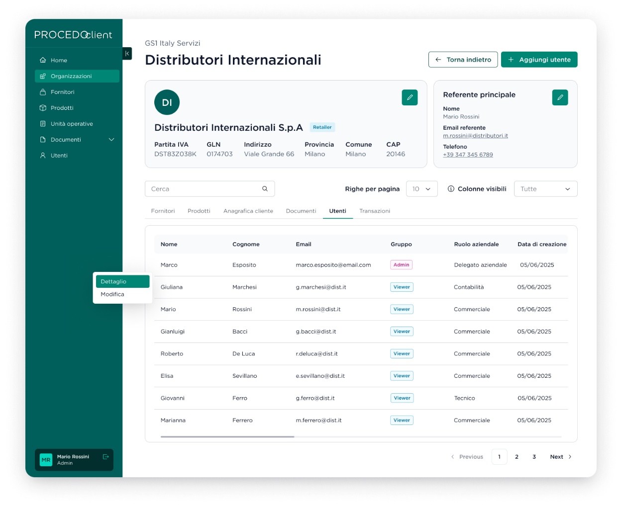
Working alongside the back-end engineers, I mapped out users and permissions across both sides of the platform , what each role could access, see, and do, covering the access to the platform and feature visualization. The result is four roles across two organizations: admin and viewer on the GS1 side, admin and viewer on each distributor's side, authenticated through SSO, with GS1 able to manage across every distributor while each distributor only ever sees its own.
Building the UI Kit and choosing a design system deliberately
Branding and the design system were deliberately left for last. I built the UI Kit after the client's marketing department granted us permission to elaborate on a free design proposal (but not too far from GS1’s branding), using the logo and colors they asked us to. Rather than building a component library from zero, I researched open-source design systems that could be adapted to fit the budget and speed up development, components the engineering team could use with only design tweaking rather than building each one from scratch.
High-fidelity screens, at last
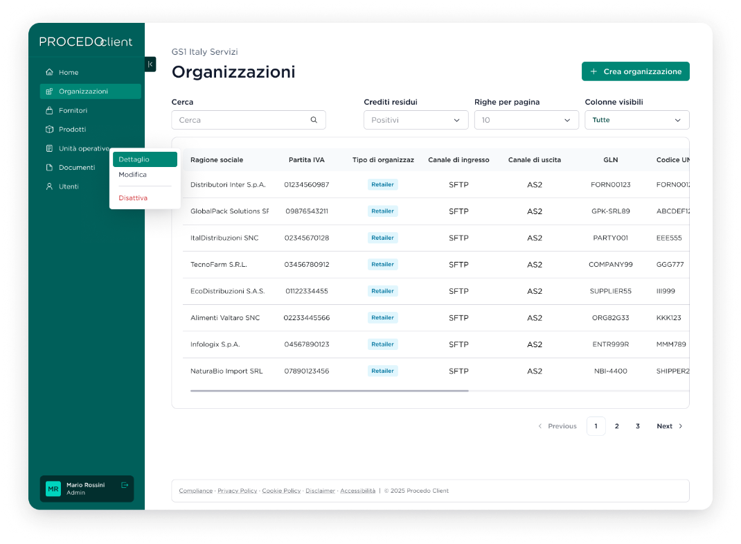
Once the UI Kit was settled did the high-fidelity screens begin, by that point every structural, interaction, and permission decision underneath them had already been worked through, so the visual design phase was assembly, not discovery.
Outcome
The project delivered a validated sitemap and task flow, a working permissions model spanning both GS1 and every distributor organization, a UI Kit and component system the engineering team could build from quickly, and a full set of high-fidelity screens covering the platform end to end, opening EDI access to a segment that GS1's more complex, established tooling had effectively locked out.
After the MVP shipped, a joint retrospective on the months of work behind it was performed with the client. The discovery phase and the UX/UI work came up on their own, unprompted, as one of the clearest positives of the project, well received not just by the people directly involved, but across the wider team on the client's side. The initial approach to the platform's architecture was also specifically called out as a strong starting point for what came after.
Lessons learned
This was one of the more daunting projects I've taken on, the subject matter was genuinely complex, and a lot of it sat well outside what I already knew as a designer.
The part I'd protect on any project like this: trust your engineering team. Letting the development team walk me through the mechanics of the system meant I could translate that complexity into something genuinely simpler for the people using it, instead of guessing at a simplification that wouldn't have held up against how the system actually worked. Developers and engineers aren't just there to build what a designer hands them, on a technical project like this, they're allies in making the design work at all.
What’s next?
The project closed with its own recommendation to keep going: continuous discovery, interviewing junior users, board members, DSF staff, and donors based on whichever improvement goals get prioritized next.
If applied, these recommendations would cut the navigation friction that sends people looking for a workaround, close the gap between the site's stated commitment to an inclusive community and its actual accessibility, and reduce how often people bypass Django's own search in favor of Google, restoring trust in a tool the community should be able to rely on first.